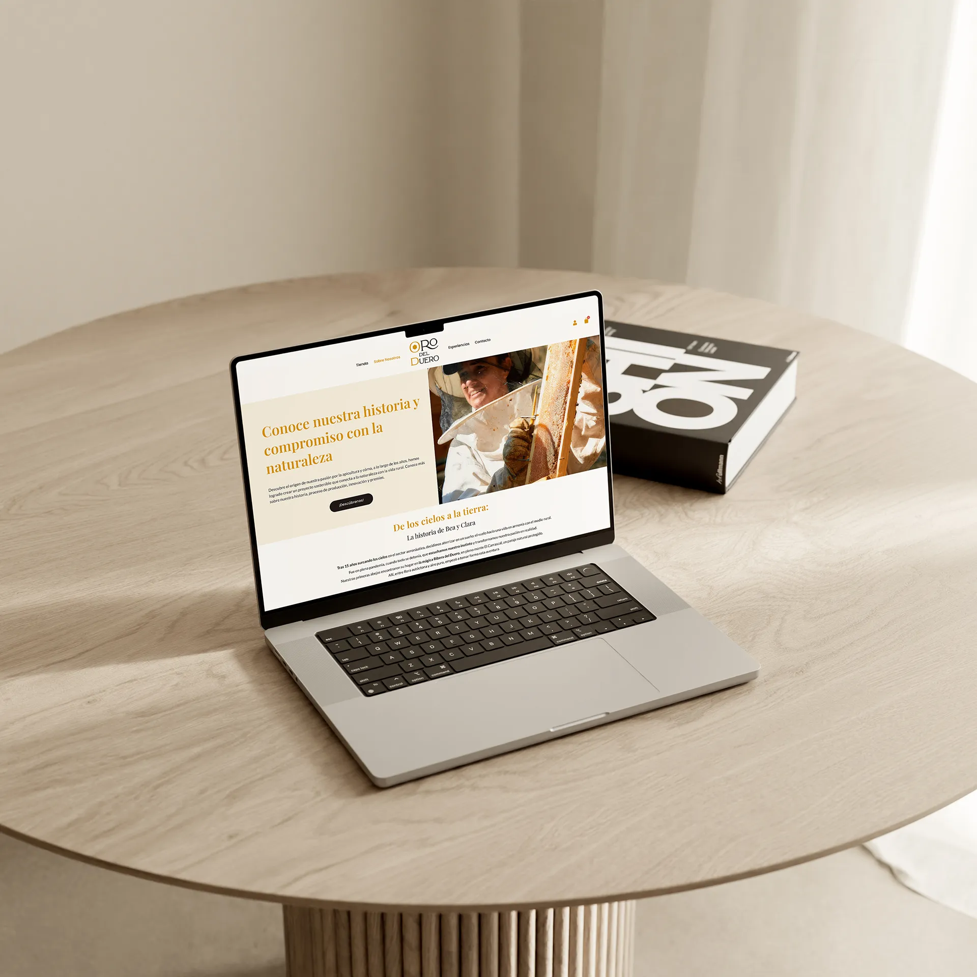
How do you bring the aroma and texture of artisanal honey into the digital environment? For Oro del Duero, I designed a web ecosystem that goes beyond a simple transaction. Starting from an incomplete technical foundation, I developed a site where every interaction reinforces the sustainability and closeness of its founders.
The design is built around a clean architecture and a distinctive typeface, ensuring the focus remains on the product and its story. An end-to-end solution that professionalises the brand and optimises conversion at every touchpoint.
UI/UX Design
Web Design
E-Commerce Development
Applied Visual Identity
Web Design & Development:
Albert Carmona
The artisan sector demands an immediate and honest connection with the consumer. I developed a clean interface fully optimised for mobile devices, ensuring that the brand story and product catalogue retained the same visual impact and ease of navigation on every screen. From the outset, my goal was to prevent the project’s rural essence from getting lost in the digital environment, so users experience the same sense of closeness whether they shop from a computer or a smartphone.
To achieve this, I worked extensively on the adaptability of every section, refining loading speed and simplifying touch interaction flows. The final design is not only an intuitive sales channel, but also a window that transparently conveys the real value of its sustainable beekeeping. The website therefore responds to the business’s current needs without sacrificing authenticity, usability and visual rigour in every pixel.


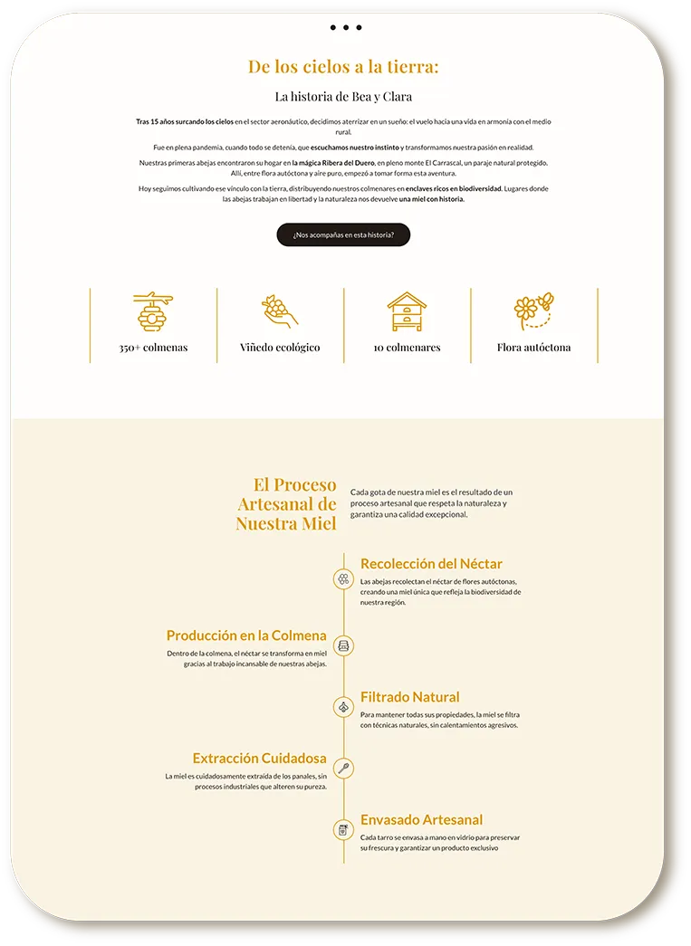
The real challenge of this project was understanding that Oro del Duero is not just an online honey shop; its value proposition includes educational workshops, outdoor tourism activities and sustainable beekeeping experiences in the Valladolid area. To reflect this diversity without overwhelming the user, I designed a visual system that balances direct sales with education, using the original colour palette based on earth and honey tones to give the entire site warmth and coherence.
I defined a distinctive typographic hierarchy for the main headings, combined with a very clean component design. This allowed me to organise the founders’ different business lines in an integrated way, enabling users to discover the shop, explore hive sponsorship or book a place on the ‘Beekeeper for a Day’ workshop within the same fluid, structured and highly professional visual narrative.

To address the variety of services and improve overall usability, I created and selected a dedicated icon system that acts as a visual thread across the different interior pages. The purpose of this resource was not merely aesthetic, but purely functional: I needed to simplify the user experience (UX) and intuitively guide the visitor’s eye towards the key features of each product and activity.
Through these clean graphic elements, perfectly integrated with the brand identity, I was able to synthesise complex concepts that previously required dense blocks of text. Now, factors such as honey benefits, workshop requirements or the steps to sponsor a hive are communicated instantly, directly and in a visually appealing way, bringing considerable lightness and dynamism to the layout design across the entire web ecosystem.
My intervention in this project was a genuine technical and strategic rescue. I found a completely unfinished and outdated web platform that frustrated users and did not do justice to the care and passion behind the brand. I redesigned the information architecture from scratch, completely cleaning and stabilising the existing technical environment to provide logical, robust and fully secure navigation.
When transforming the site structure, I prioritised narrative clarity and the removal of friction points that interrupted the customer journey. The result of this redesign process is the transition from unstable, neglected code to a fluid, solid platform ready to scale the business, demonstrating how strong web design execution can restore digital control and confidence to an artisan project.
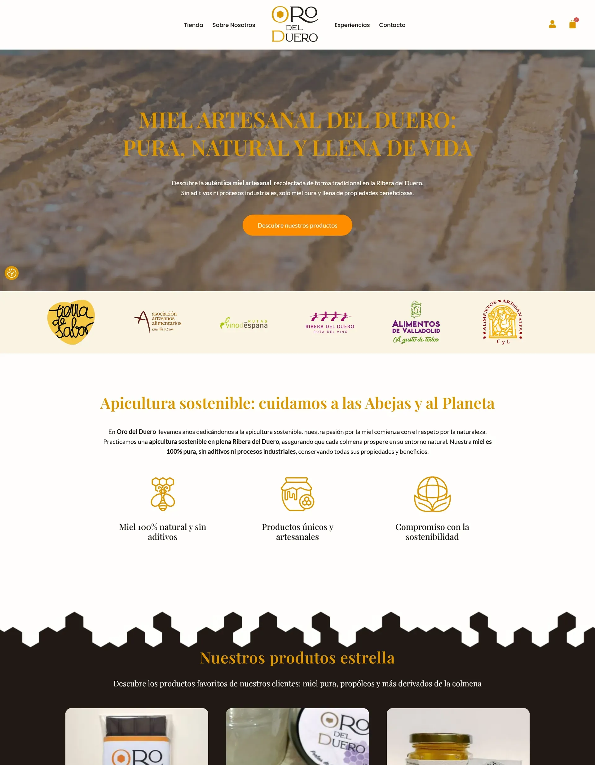
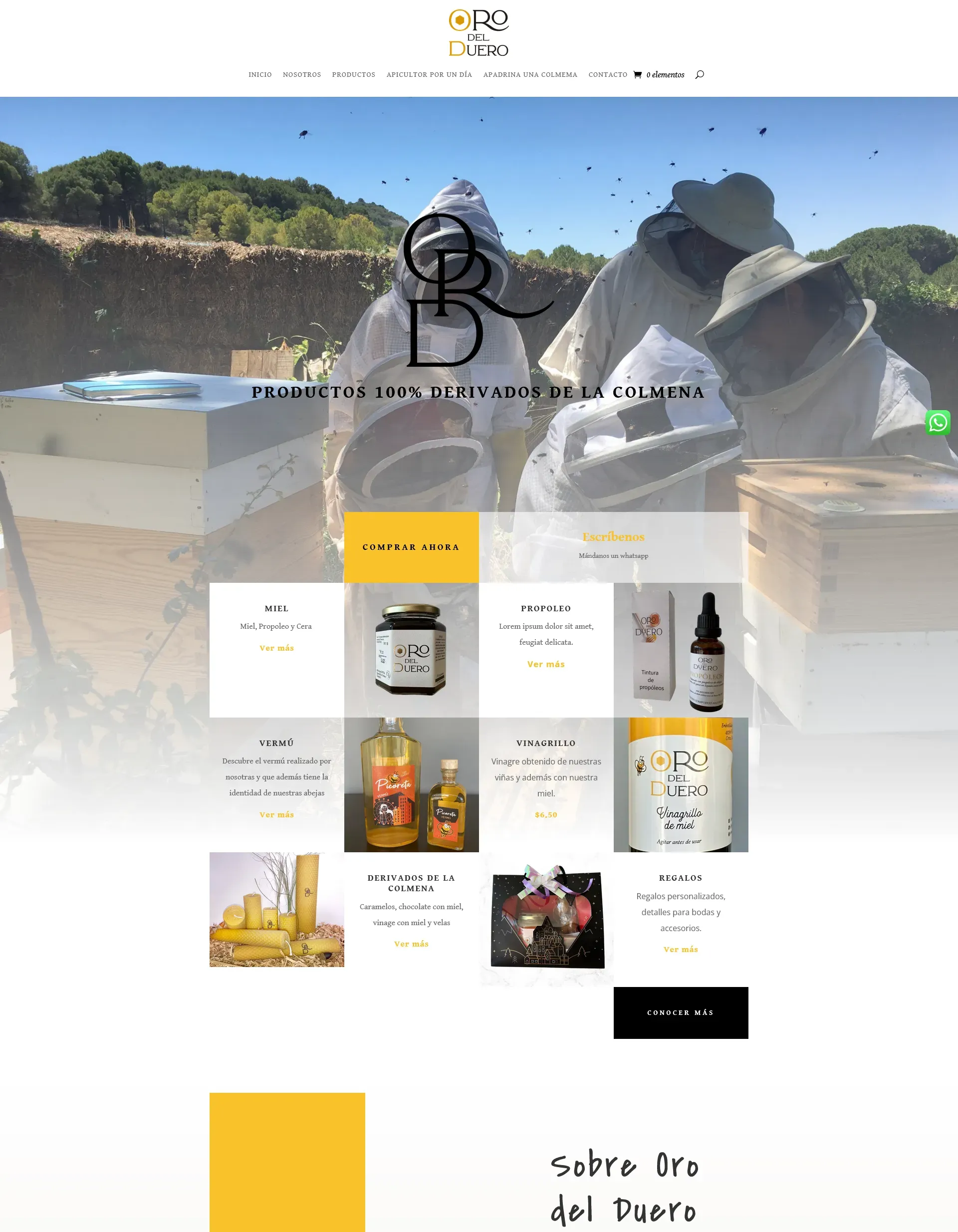
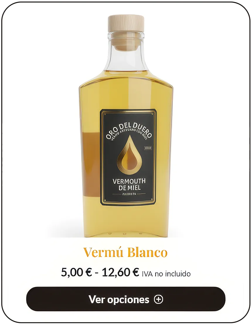
I turned e-commerce into the project’s main engine through the advanced integration and customisation of WordPress and WooCommerce. I did not simply build a standard shop; I designed specific layouts and detailed technical product pages for each honey variety, ensuring that the brand storytelling accompanies the customer through the final step of the cart, turning the purchase into an intuitive and enjoyable process.
I meticulously optimised the checkout flow, reducing the steps required to complete the transaction and simplifying the payment gateway for the end customer. In addition to driving direct physical product sales, I structured the system to facilitate the booking and purchase of experiential services, giving the founders a centralised, agile management tool fully optimised to maximise their conversion rate.



To complete the user experience, I developed and implemented a robust, customised customer area. This section was vital for a business model that includes recurring and community-based services, such as hive sponsorship. I designed an intuitive dashboard where registered users can independently manage their details, review their complete purchase history and download their invoices without complications.
This private area not only improves brand perception and provides a premium experience, but also dramatically reduces the support and manual management workload for the founders of Oro del Duero. By automating access to order status and sponsored hive tracking, I created a direct and efficient communication channel that encourages long-term customer loyalty and reinforces the technical strength of the entire e-commerce platform.

© 2026 | Albert Visualab | Diseñador web y 3D | Política de privacidad | Política de cookies