Brand Product & Food Photography /
Web & Marketing Design
Kamarere is a Spanish food brand that transforms fruits and vegetables into gourmet seasoning blends. Every pouch and jar is packed with colour, freshness, and the joy of cooking with natural ingredients. Our task was to translate this sensory world into a cohesive brand experience, creating a set of materials for the brand communication and a new multilingual e-commerce.
Rather than taking each task as a separate collateral, we developed a complete creative ecosystem: still life and e-commerce photographyfor websiteand online store,packaging designand illustrationfor the honey blends line, brochures for markets and fairs, and a websitewith integratede-commerce. Each piece was created to express Kamarere’s vibrancy and authenticity: dynamic, juicy, and always natural
SERVICOS
UI/UX Design
Web Design
E-Commerce Development
Applied Brand Identity
Product Photography
Packaging
EQUIPO
Web Design & Development: Albert Carmona
Product Photography, Packaging & Ilustration:
Irina Lopik
WEB DEVELOPMENT & STRATEGY
"Expandinb B2C horizons through E-Commercs"
A dual-language digital storefront engineered for global commercial growth
The primary goal of this project was to transform Kamarere’s online presence from a restricted, static informational website into a powerful, fully functional multi-language e-commerce platform. Facing the challenge of a business with no online sales capabilities, I structured a strategic digital solution designed to open direct-to-consumer (B2C) channels and scale their market reach. I implemented a robust architecture using WordPress and WooCommerce, developed natively in both English and Spanish to guarantee a seamless international shopping experience.
I focused heavily on creating an intuitive user journey (UX) that bridges the gap between raw product education and direct conversion. By technical integration of advanced multi-language localization plugins, I ensured that every product description, checkout field, and automated client email adapts flawlessly to the user’s preference. This development didn’t just add a digital cart; it established a scalable, secure, and high-performance commercial engine tailored to support Kamarere’s global business expansion goals.
THE DIGITAL TRANSFORMATION
"From static interface to responsive market place"
Overhauling an amateur layout into a high-conversion digital ecosystem
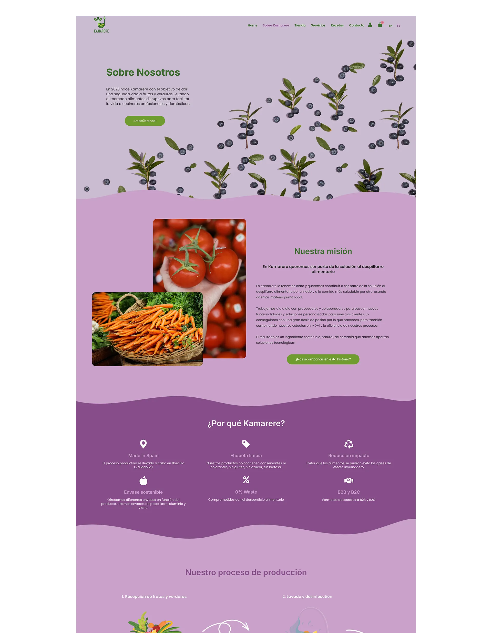
Before my intervention, Kamarere’s website lacked structural hierarchy, modern UI standards, and any form of purchasing flow, severely limiting their brand credibility. I took charge of the complete interface overhaul, designing a responsive and fluid environment from scratch. My technical execution focused on cleaning the legacy digital footprint and establishing a solid UI system where user interactions are optimized for both desktop and mobile viewports.
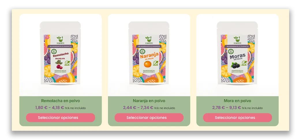
I redesigned the information architecture to showcase the product categories with absolute clarity, ensuring that technical details about dehydrated products remain digestible. By replacing the outdated, rigid layout with a dynamic, grid-based modern design, I managed to build a professional interface that commands trust. This radical transformation highlights how strategic web design can turn a flat informational site into an engaging, conversion-oriented platform engineered for the modern consumer.
AfterBefore
AfterBefore
AfterBefore
Website Design & E-Commerce Implementation
"A digital space for colour and taset".
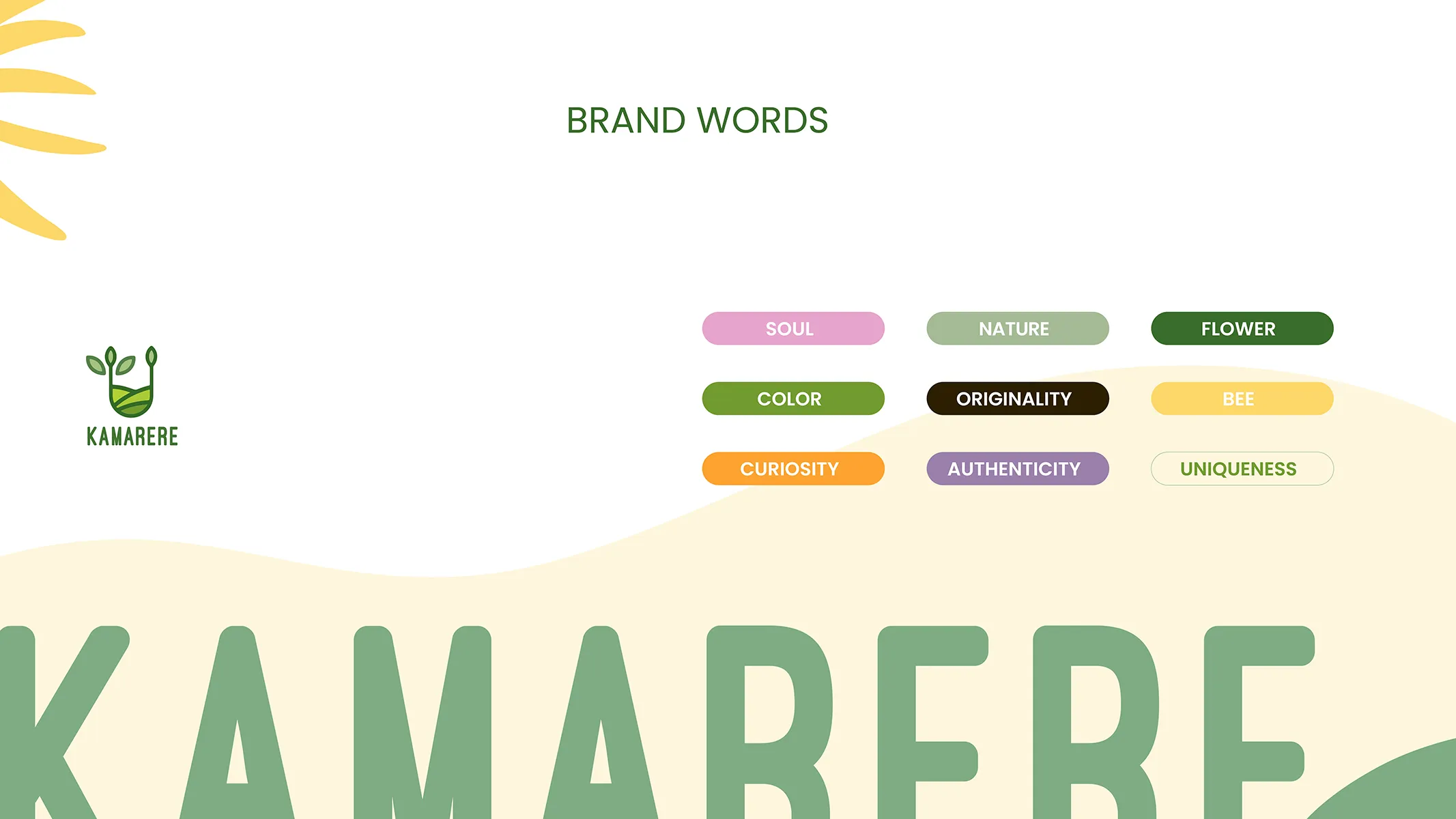
Designing the Kamarere website means more than building a store. It is about creating a digital space where brand values could come alive. Soul, nature, authenticity, and originality became the guiding words shaping both structure and aesthetics.
The site balances a minimalist framework with bursts of vibrant colour. Fruits, herbs, and seasonings appear as visual accents throughout the interface, offering rhythm and brightness without overwhelming functionality.
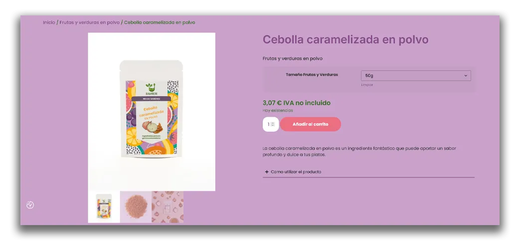
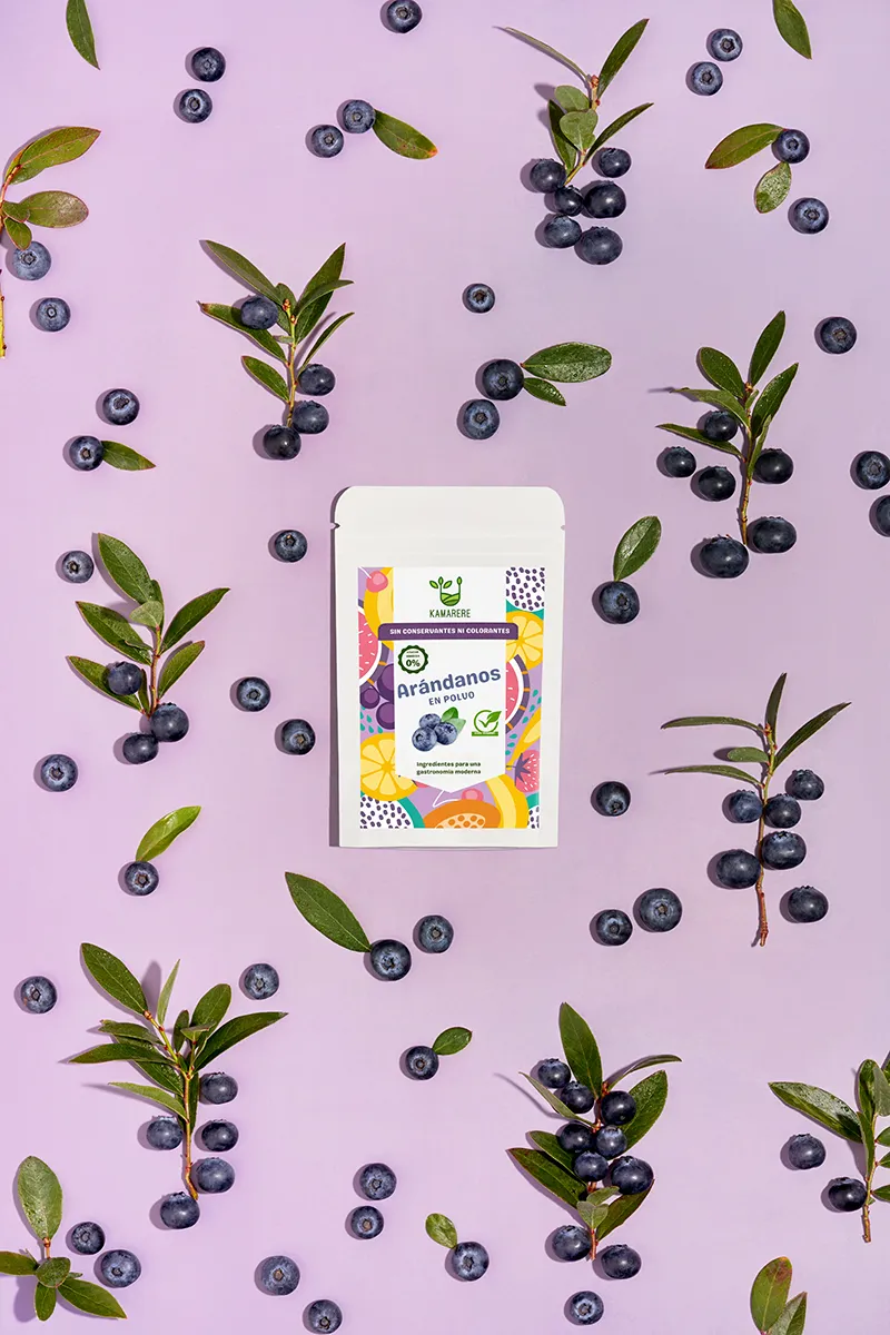
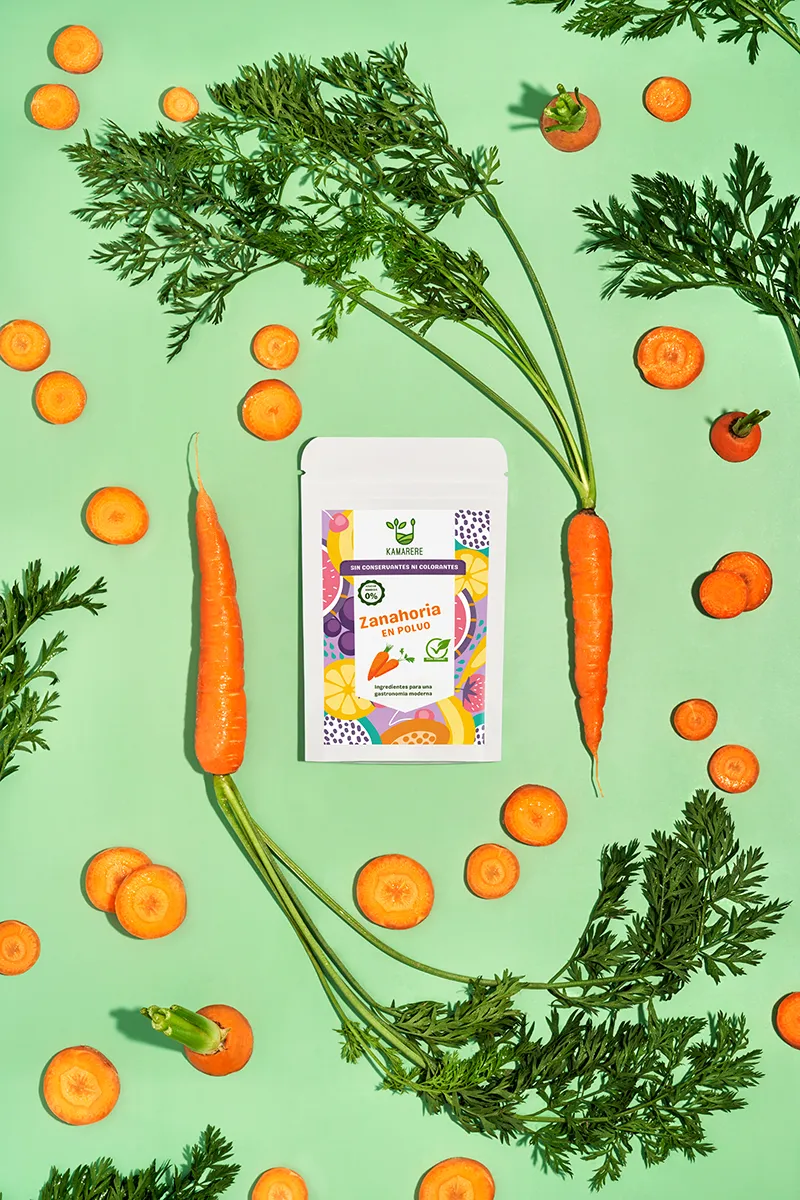
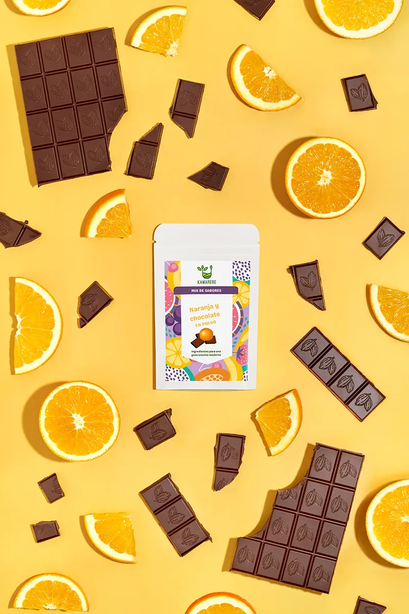
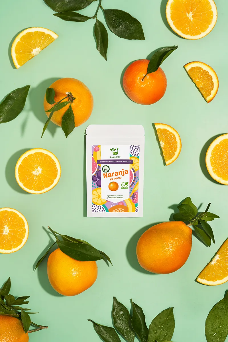
E-commerce implementation is developed with clarity and flow in mind. From homepage storytelling to product detail pages, each step invites to explore. Photography anchors the experience: vivid flat-lays, stop-motion sequences, and ingredient close-ups that highlight natural textures and freshness. The integration of ingredient backstories ensures that every product feels rooted in origin and authenticity.
To make the process even more transparent, we created mini animations that show, in just a few seconds, how fresh produce transforms into natural powders. This easy-to-grasp, visual storytelling makes the brand’s promise tangible, layering motion and meaning into the overall experience.
The final result is a platform where sensory richness is elevated by clean design: an online presence that reflects Kamarere’s uniqueness and inspires curiosity with every click.
Creative Still Life Photography
"A bite of colour in every frame"
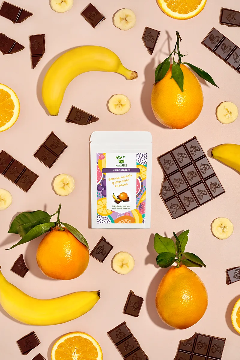
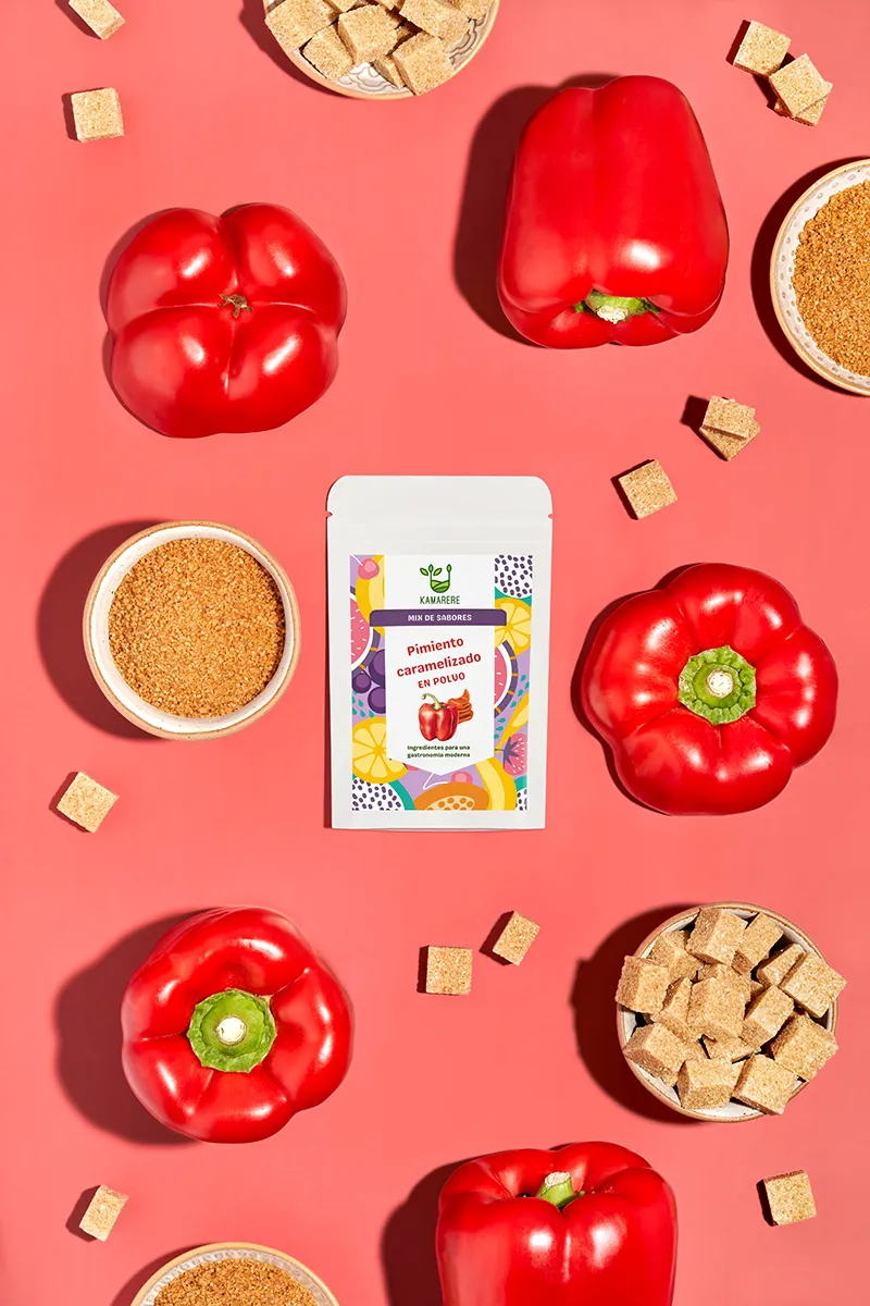
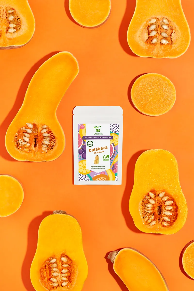
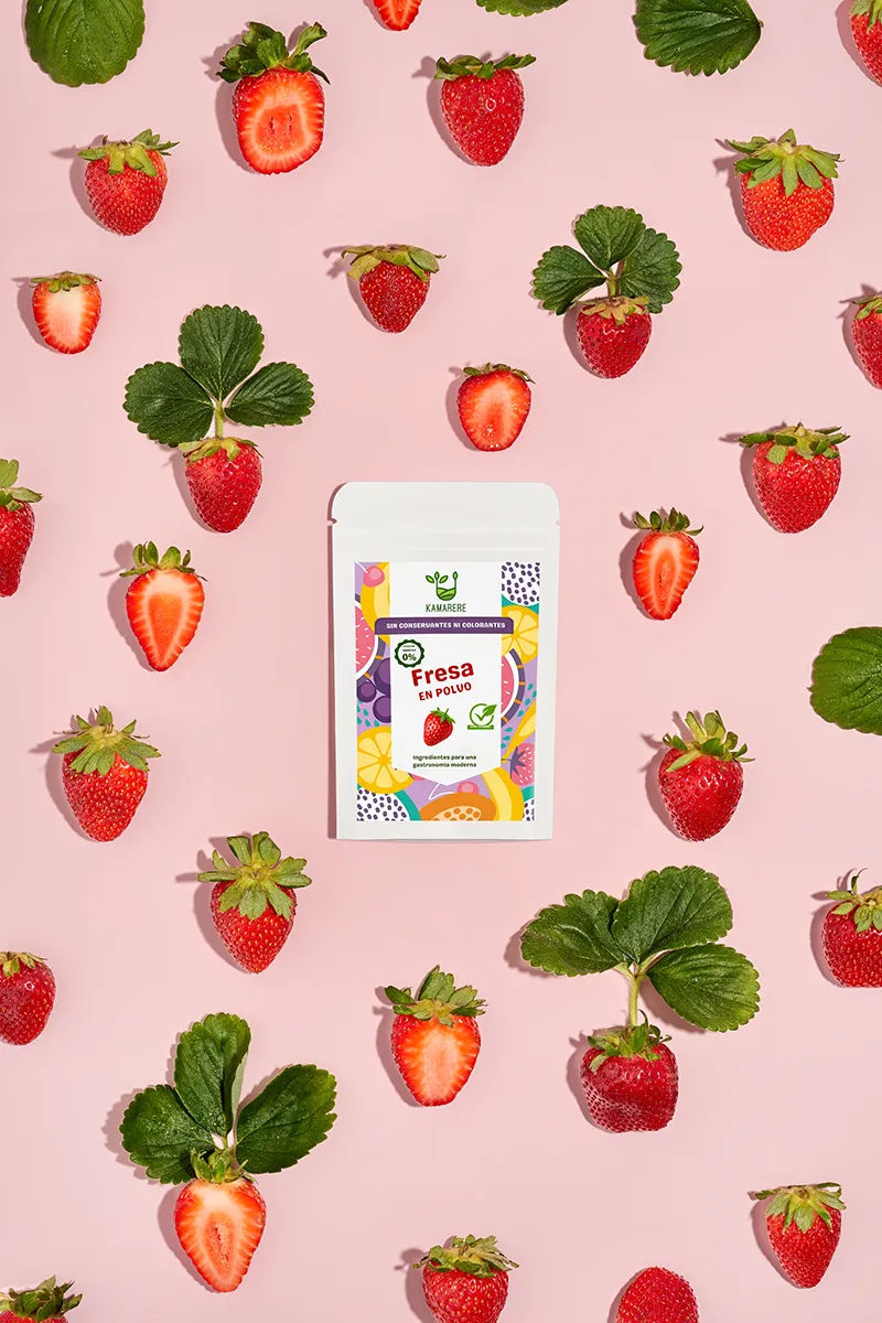
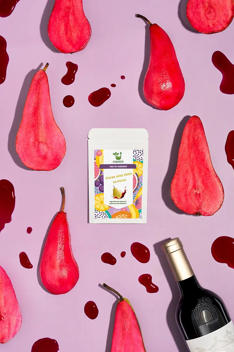
We created vibrant studio shots and short stop-motion animations where fruits and herbs come alive in playful choreography. The still-life compositions explored flat-lay elegance—perfectly arranged, yet full of tactile energy and visual rhythm.
For the animations, we worked with Kamarere’s powders, fruits, and herbs to build dynamic sequences where real fruits and vegetables transform into powders, illustrating the natural process in just a few seconds. This fast, sensory storytelling gives consumers an immediate impression of the brand’s natural origins and core values. Each frame celebrates movement, texture, and colour, turning ingredients into vivid, finished products.
These visual stories became a central brand tool: adaptable for social media, powerful in marketing, and engaging for e-commerce.
E-commerce Photography
"Clarity builds trust. Vibrancy builds desire"
Our e-commerce photography was designed to bridge the gap between screen and reality, helping customers feel Kamarere’s products before they hold them. Every shot highlights colour accuracy, ingredient texture, and product detail with precision, ensuring a faithful representation online. The goal was to communicate freshness and flavour without overwhelming the viewer, creating images that are as informative as they are inviting. The final collection of images gave Kamarere an online presence that feels professional, reliable, and appetising, empowering consumers to buy with confidence and curiosity.
Packaging Design & Illustration
"Tasty illustration for gourmet experience"
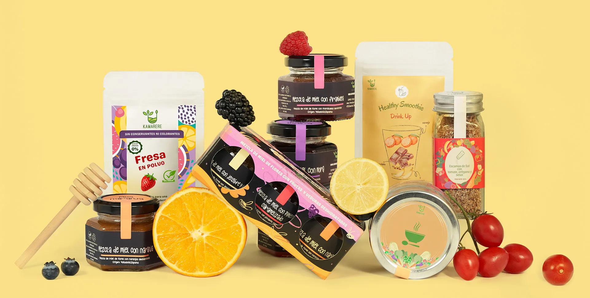
For the honey blends line, the challenge was to design packaging that felt both connected to Kamarere’s main identity and distinct in its own language. We began by returning to the source of inspiration: honey itself. Its natural richness, tactile textures, and raw sweetness became the foundation for our creative direction.
We developed moodboardsthat combined nature references with artisanal cues, exploring how to visually translate nourishment, care, and authenticity. From there, we turned to illustration: hand-drawn sketches with rough textures, digitised and coloured to preserve their tactile quality. This freehand approach brought imperfection, warmth, and a sense of human touch—key to communicating natural origin. Colour was central in creating a visual identity separate from the powders line, while remaining true to the brand. Instead of greens, we built a palette of pastel yet vibrant tones (violet, orange, pink, and yellow) balanced with earthy browns in the background.
Lettering followed the same artisanal approach: drawn by hand, scanned, and digitallycoloured, then integrated into playful compositions. The process involved rounds of colour testing and adjustments until the packaging felt harmonious, fresh, and representative of Kamarere’s values.
PACKAGING DESIGN FOR HONEY PACK
Marketing Collaterals: Brochure for Markets & Exhibitions
"A pocket-sized market stall"
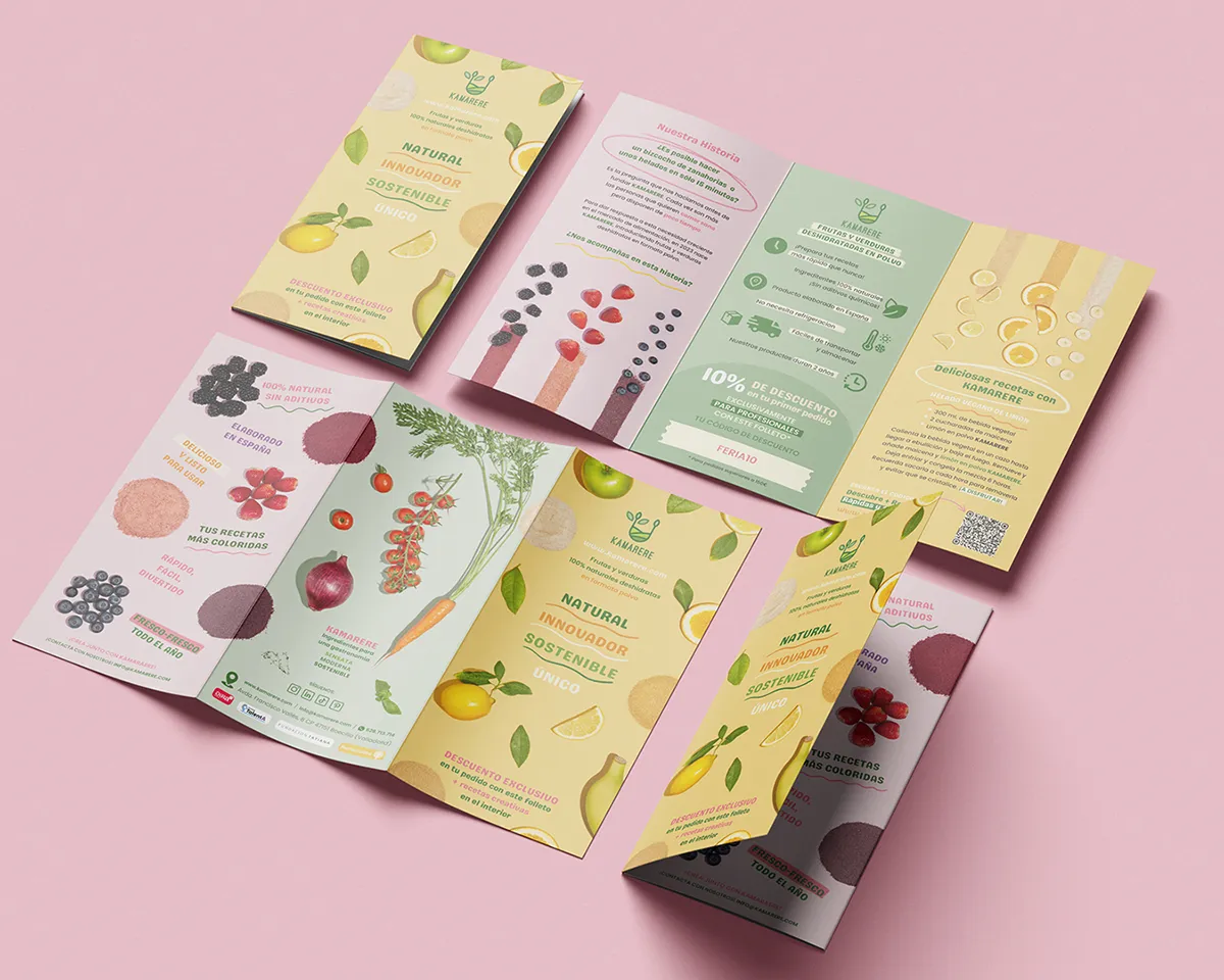
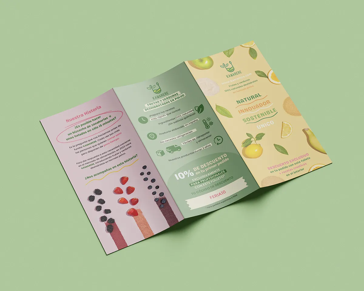
At farmers’ markets and food fairs, Kamarere’s presence needed to feel alive and inviting. The brochures mirror the brand’s palettes, photography, letterings and illustrations: light, expressive, and layered with ingredient snapshots and textured compositions. Every fold and page turn acted as a mini sensory journey – from concept to flavor – in the hands of people connecting face-to-face with the brand. Beyond paper, the design extended into digital touchpoints: QR codes leading to recipes, discount codes, and videos enriched the experience, turning a printed piece into a multi-platform gateway that keeps the brand alive long after the fair.